Once you have moved past the requirements gathering phase and are approaching the design and build phase, you may be tempted to open your Power BI Desktop designer and simply start dragging and dropping visuals onto the report canvas.
Before you start, take a few moments to understand that the purpose of your dashboard is to provide information to your consumers. These will vary from C-Level executives to business analysts, and maybe even your organisation’s customers.
One common thing they all share is the need to be able to consume and digest information quickly and easily. How can we do that?
Here are 6 principles which will help your goal of building easy-to-consume dashboards:
- Plan your layout
Consider the principles of layout design and utilise the principles of the “Z-Pattern” layout. - Frame and focus
Usage of borders or “negative space” can go a long way to grouping information logically. - Colours – less is more
When it comes to colours, often less is more. Do not over clutter your dashboard with a multitude of colours. - Leverage graphics
People are visual creatures who respond to graphical images. Incorporating the use of simple images helps to engage your information consumer. - Choose the right visualisation technique
Power BI has a rich wealth of visuals available to consume, and each is designed to project certain information. - Be consistent
If your dashboard is built with a similar look and feel, your users will be able to identify with the information as being common and consistent.
Now let’s understand each of these principles in more depth. While I bring up some Power BI examples, these principles can be used across any platform for good dashboard design.
1. Plan your dashboard layout
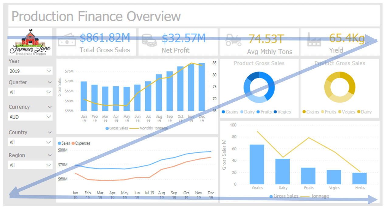
A common design layout is the “Z-Pattern”, so called because of the user’s eye focus which follows the shape of a “Z” as it moves across the page.
- A reader’s eye starts in the top left corner and scans across the top of the page, where important information is likely to be found.
- When the eye reaches the top right corner, it is then drawn down to the bottom left corner at a diagonal.
- It then moves across the bottom of the page.
Understanding that the user’s focus is likely to be following this pattern, it is important to utilise the space along these focus areas to present information. In the dashboard page below, we can see four key metrics clearly demonstrated strategically across the top of the page in the sweet spots of the Z-pattern.
2. Frame and focus
One of the single most important and powerful design guidelines is the use of “negative space”, also referred to as “white space”. Put simply “negative space” is the blank neutral area between visual elements on a dashboard. You could consider this as the boundary around a visual, or group of visuals.
The reason this is so important is that it helps in the composition of an area and assists in “defining a space” as being separate to those spaces around it.
If we consider the various visual elements that we may choose to include on our dashboard, we need to start grouping those into a logical collection. By leveraging the “negative space” it helps frame our area and draw a user’s attention to that area as being separate and distinct from those around it.
By leveraging the width of the “negative space” you can define the importance of an element. For example, you may decide on three main sections, and inside one of these sections you break it out into four smaller sections. See this demonstrated in the example below.
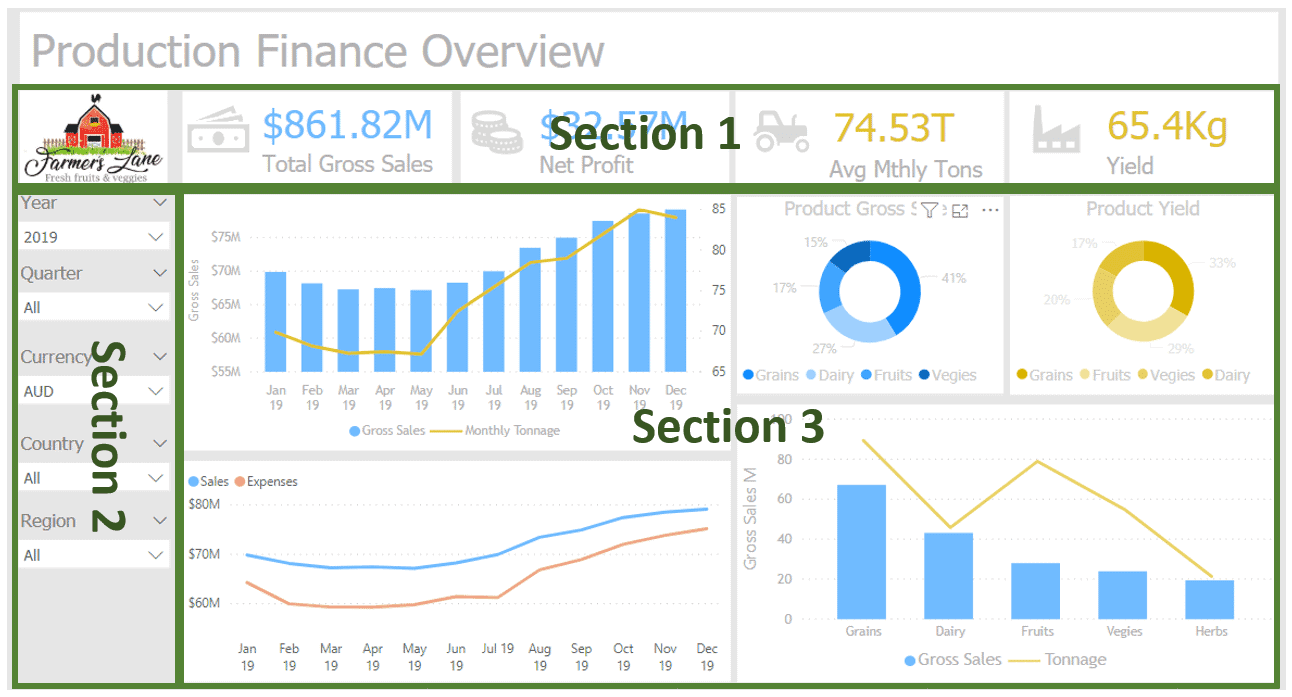
By using double the negative space around the main sections, users can distinguish the difference of these three areas as being grouped into separate sections.
3. Colours – less is more, especially with tone
One of the most important elements in dashboard design is colour. It is hands down the most crucial element that contributes to capturing a user’s attention.
There are entire books written on the topic of how to use colour. To some it may appear like black magic, but there is a reasonable amount of science that feeds into the creative design element. One of the best resources you can leverage is the Colour Wheel (there’s an image of this below).
The strength of the Colour Wheel is that it allows you to easily select colours that are referred to as:
- Analogous: Colours sitting next to each other
- Complementary: Colours on the opposite side of the wheel
When it comes to colours on a dashboard, less is more – choose two or three colours for presentation. Avoid the temptation to include many colours as this will become confusing and distract from the information you are trying to visualise to your consumer.
When considering which colours to use, it is best to understand the effects that analogous and complementary colours have on the user’s attention:
- Analogous colours often match well and create serene and comfortable designs. Analogous colour schemes are usually found in nature and are harmonious and pleasing to the eye.
- Complementary colours are high contrast. This creates a vibrant look especially when used at full saturation. This colour scheme must be managed well so it is not jarring.
Unless you are confident and can understand the effects that complementary colours can have, it is easier and safest to focus on a single colour and choose two analogous colours from the wheel.
A good place to start would be the brand/company colour and then look for the corresponding analogous colours. This will give you three colours you can work with across your dashboard. Once chosen, utilise the gradients of your presentation colours to be effective and provide more range.
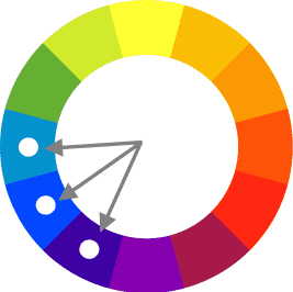
If you start with the bright blue, the corresponding analogous colours
would be dull blue and dark purple.
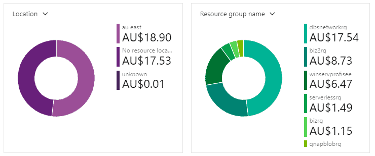
An effective design pattern is to use a single analogous colour per metric, and then leverage gradients to achieve the ability to communicate change or relationship in different metrics on a combined visual.
In the following example the dashboard designer was faced with the challenge of presenting information for only one metric on their dashboard – cost per month. In order to draw attention to the relationship between the various items, they have selected four colours – an analogous pair of purples and an analogous pair of greens.
Once the colours are selected, you can leverage gradients to demonstrate the various slices of this single metric, with each logically grouped.
4. Leverage graphics
Human beings by nature are visual creatures. From birth we have been able to analyse vast volumes of information through our eyes, without even being aware of it.
When correctly used, graphics are a very powerful tool for leveraging this ability to digest information.
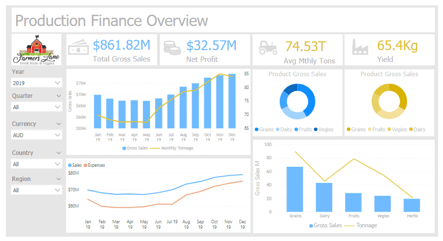
In the above dashboard there is a visual icon utilised alongside each of the metrics. This subtle use of graphics:
- helps the viewer immediately understand what KPI is being measured
- softens the delivery of numerical information into a more human relatable visual.
If you are using Power BI, an additional way to utilise graphical delivery is to leverage the InfoGraphic visualisation from Microsoft. This powerful visualisation enables the incorporation of graphical icons or pictures into charts to represent relationships.
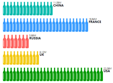
In the above chart from Microsoft InfoGraphic, bottles have been used to graph Wine Consumption by Country. It is a simple chart. But the addition of the wine bottle graphic provides another dimension to engage the user with and demonstrate information graphically.
5. Choose the right visualisation technique
It is important to remember that bar charts and heat maps are of little to no use in the wrong context. If anything, they will confuse your user and make the information harder to understand. It may even portray the wrong message.
If you are not sure which visualisation or chart to use, it may be a good idea to refer to a Visualisation Decision Matrix, such as the following one published by Federico Rosenhain, a prominent data mining and business intelligence expert.
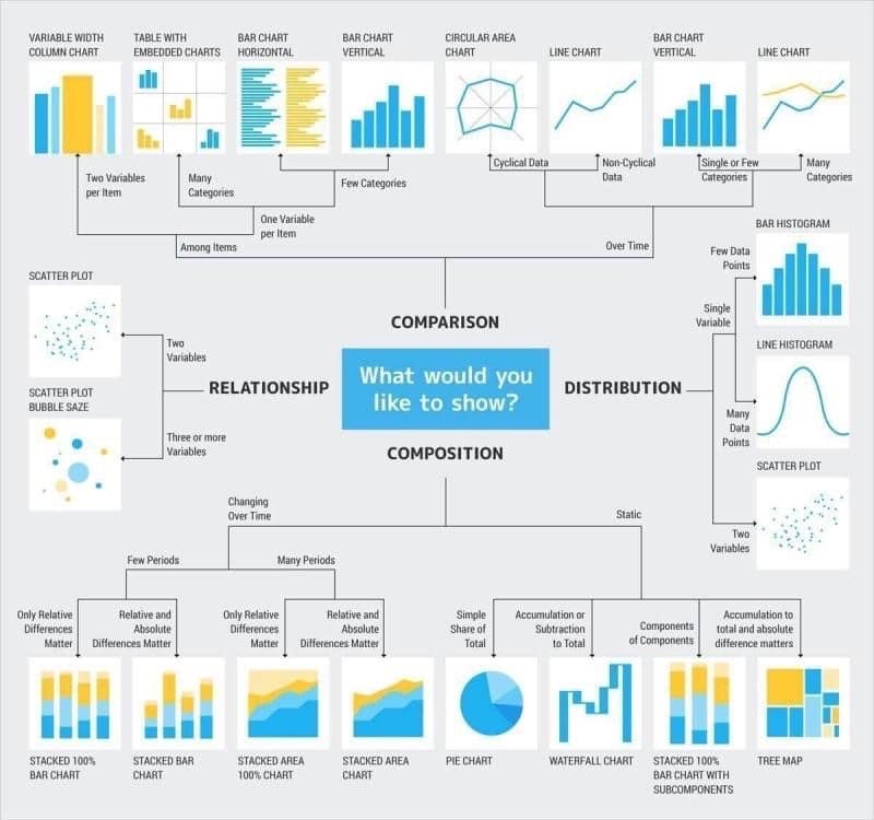
It provides a very clean and simple decision matrix to assist with the majority of information presentation needs.
For example, is your information for “Comparison” or “Composition”? If it is for “Comparison”, is the information to be compared “Among Items” or “Over Time”? This matrix can assist you in deciding on the more appropriate style of visual to demonstrate the message you are trying to convey.
Here are a few of the more commonly used visualisation types.
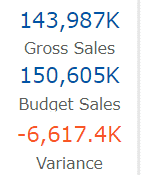
Data cards
Data cards are very useful for demonstrating single or multiple numerical values. When combined with Conditional Formatting (ie, changing the shade or colour based on a value range) they can very quickly draw a user’s attention to an issue that should be noticed.
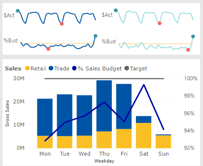
Sparklines
Sparklines can be added to a Power BI dashboard by using a custom visualisation add in. Sparklines are usually added without a scale, and hence do not have easily identifiable value points. They show trends very well and are extremely useful for showing multiple trends together in a small and compact space to demonstrate patterns of behaviour.
Sankey diagrams
Sankey diagrams are a way of demonstrating the flow of values from one group to another. It utilises the length of the line to demonstrate the relationship as a percentage. When incorporated with the correct filters and slicers, they can identify how a subsection of information flows from source to destination and the path it takes.
The below example shows distribution of votes from an election. What we can see from the chart is how preference votes have flowed from one candidate to the next. The Sankey is also interactive, and can be utilised as a slicer for other visuals in the dashboard
6. Be consistent
When it comes to demonstrating information, you want to ensure your consumers can digest your message at the first glance.
In addition to maintaining a common look and feel which can be achieved through consistent fonts and colours, ensure your metrics and KPIs are labelled consistently throughout your dashboards.
Introducing variations in the formatting and labelling of your metrics can start to introduce confusion to your information consumers. This slows down consumption and reduces the effective utilisation of your dashboards.
Closing comments on BI dashboard design
You should never underestimate the importance of aesthetics when it comes to dashboard design. If your dashboards are pleasant to look at, and simple to consume, users will be more likely to engage and interact. This helps in building trust and confidence between the dashboard designers and the information consumers.
By following the above six design principles you will be able to develop a set of dashboards that is hopefully aesthetically pleasing, whilst successfully delivering information in an effective and efficient manner.