What are dashboards?
Workday Adaptive Planning Dashboards are a built-in visual reporting tool that transforms your live cloud data into interactive, easy-to-read charts and KPIs.
It provides finance teams, executives and department heads with an at-a-glance view of business performance, making it simple to track trends and monitor key metrics without digging through spreadsheets.

Dashboard tutorials and articles
Dive into comprehensive Workday Adaptive Planning dashboard tutorials and articles, created by our team of experts and consultants.
Workday Dashboard Examples: How To Set Up Active Dashboards
Bring sheets and visualisations together on one dashboard for a consolidated view, and see the impact of your changes in real time. Learn how to set up Active Dashboards in Adaptive Insights.
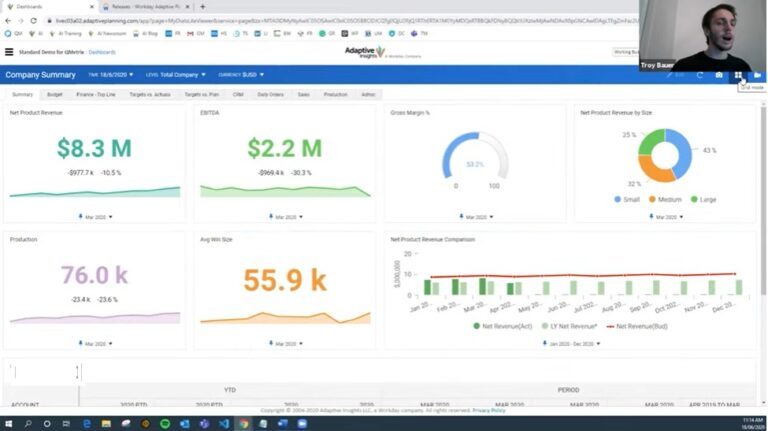
Introduction to dashboards in Workday Adaptive Planning
Here we run through how to build a basic suite of graphics using the dashboard in Workday Adaptive Planning to review revenue performance.
Workday Adaptive Planning technical tips
Watch Dashboard tips:
Two Minute Tuesday videos
Two Minute Tuesdays are a video series that deliver quick, bite-sized Workday Adaptive Planning technical tips in two minutes. Created by the QMetrix team, these practical tutorials help users optimise and troubleshoot their planning and reporting workflows, and are watched by thousands worldwide. Watch the tips and tricks here to enhance dashboards in Workday Adaptive Planning and level up your skills.
How to create folders to organise perspectives
Within the 2025R1 Workday Adaptive Planning release, users are now able to create folders to help organise the perspective overview page. Learn how to do this here.
How to use context filters in dashboards
A common concern users have with dashboards is that they can’t fit as much information as they would like on a small canvas. This video demonstrates how to use context filters to optimise your dashboard and take it to the next level.
How to configure your organisation’s colours for dashboards
Configuring your organisation’s colours in your Workday Adaptive Planning dashboards allow users to include corporate branding, maintaining visual consistency and keeping things sleek. Here’s how to do it.Within the 2025R1 Workday Adaptive Planning release, users are now able to create folders to help organise the perspective overview page. Learn how to do this here.
How to incorporate multi-select filtering
Can you select multiple dimension values in filter? Yes. In this video we explore how to incorporate multi-select filtering across OfficeConnect, Web Reports and Dashboards in Workday Adaptive Planning.
How to use the multi-select feature in reports and dashboards
In this video we look at how to enable and use the multi-select feature, level parameters, and how to slice and dice data in a specific way.
How to create a Geo Map in dashboards (Part 1)
Geo Maps are a great feature to help you visualise your data, and spot important trends and new opportunities for your business. Here’s how to add customer properties for location data and set up properties for dimension values.
How to create a Geo Map in dashboards (Part 2)
Following on from our first Geo Maps episode, we show you how to set up a basic Geo Map on Dashboard after the custom properties for dimensions are set up. Here’s how to add underlying accounts and fill in location dimensions to generate the Geo Map.
Conditional formatting in dashboards
Conditional formatting is an excellent way to highlight favourable or unfavourable trends in visualisations. This will walk you through how to build a basic column chart that compares Budget and Forecast for a financial year.
How to create a waterfall chart in dashboards
Waterfall charts are a great way to visualise movements between two components. This video demonstrates how to create a waterfall chart to see the movements between Budget and Forecast Revenue.
Looking for more Workday tips?
Workday Adaptive Planning services for finance teams
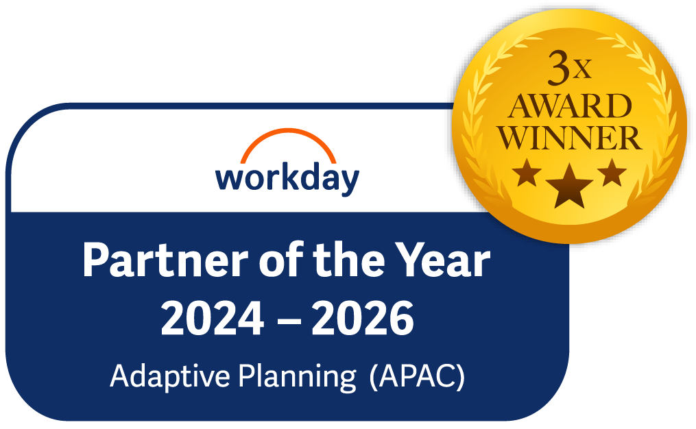
QMetrix has implemented 100+ solutions for finance teams, and have been named APAC Partner of the Year by Workday Adaptive Planning. We provide end-to-end services from analysis to design and implementation. Learn how we can help.

Workday Adaptive Planning Implementation
Ensure your platform is built on best practice, unique to what your business needs – deliver short-term wins and long-term goals

Workday Adaptive Planning Health Check
Already a Workday Adaptive Planning user? Review your current instance and optimise it for maximum return

Workday Adaptive Planning Integration
Connect Workday Adaptive Planning with your source systems for smooth data flows and accurate, timely data
Want to receive Workday Adaptive Planning news?
Get the latest videos and release information in our newsletter. Fill in the form below to subscribe.